| |

Defining UI Design Elements for Light and Dark Themes

In user interface, UI design, color goes beyond aesthetics—it’s the foundation of experiences that feel accessible, intuitive, and delightful. A key to getting this right is understanding lightness, measured as L* in the CIELAB color space. Lightness, or how light or dark an element appears, shapes readability and usability, whether you’re crafting a bright, airy app or a sleek, dark dashboard. This guide will walk you through using L* to create UI elements that shine in any theme.

What’s CIELAB L* and Why Does It Matter?

CIELAB is a color system that breaks down hues into three components: L* for lightness (from 0 for black to 100 for white), a* for the red-to-green axis, and b* for yellow-to-blue. Unlike raw luminance—a physical measure of light intensity—or brightness, which is more about perception, L* is all about perceived lightness. It’s designed to match how our eyes see differences in light and dark, making it a powerhouse for UI design.

Why L* over, say, HSL’s lightness? In HSL (Hue, Saturation, Lightness), the L value also ranges from 0% to 100%, but it’s not perceptually uniform. For example, HSL’s 50% lightness for yellow (#FFFF00) looks way brighter than for blue (#0000FF), throwing off contrast. CIELAB’s L*, on the other hand, ensures that a jump from 40 to 50 looks as consistent as 80 to 90, giving you precision for text legibility, button visibility, and overall balance. That’s why it’s the gold standard for UI designers who care about accessibility and polish.

Light Theme: Clean and Clear

Light themes radiate openness—think crisp white webpages or minimalist apps. With high L* values for backgrounds and low ones for text, they create a sharp, inviting contrast. The table below lays out the specifics, but imagine a main background at L* 95–100 (pure white) paired with text at L* 0–10 (deep black)—it’s all about clarity and simplicity.

Dark Theme: Sleek and Easy on the Eyes

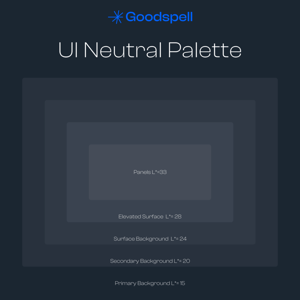
Dark themes bring sophistication and comfort, especially in dim lighting—like late-night browsing. Here, low L* values dominate backgrounds, while high L* values lift text and accents. Picture a main background at L* 0–5 (near-black) with text at L* 90–100 (bright white)—it cuts glare and adds a premium vibe. Check the table for the full breakdown.

Implementation Tips for Designers

  • Accessibility: Shoot for a contrast ratio of 4.5:1 for text and 3:1 for interactive elements. Tools like WebAIM Contrast Checker make this easy.
  • Consistency: Keep layers distinct—main backgrounds, cards, and modals should feel separate but cohesive.
  • Dynamic States: Adjust L* by ±10–15 for hover or active states—lighten buttons in dark themes, darken them in light ones.
  • Visual Psychology: Light themes feel fresh and professional; dark themes ease eye strain and ooze elegance.

Wrapping Up

Harnessing CIELAB’s L* to define UI elements in light and dark themes lets you craft interfaces that are stunning and user-friendly. It’s a science-backed way to ensure your designs don’t just look good—they feel right. Want to experiment with these ideas? Try our Dynamic Color Palette Generator to bring your vision to life.

Final Table

Here’s the rundown of L* values for light and dark themes, sorted by category—see the table below for the full list!

Design Element Light Theme Dark Theme
1. Backgrounds
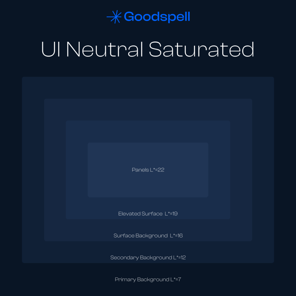
Primary Background L* 95–100 L* 0–5
Secondary Background L* 90–95 L* 5–10
Surface Background L* 80–90 L* 10–20
Elevated Surface L* 95–100 + shadow (L* 90) L* 0–5 + shadow (L* 15–20)
2. Text and Content
Primary Text L* 0–10 L* 90–100
Secondary Text L* 10–20 L* 80–90
Interactive Text (Link) L* 30–40 L* 60–70
Disabled Text L* 40–60 L* 40–60
3. Interactive Elements
Primary Button (Normal) L* 30–50 L* 60–80
Secondary Button (Normal) L* 80–90 L* 20–30
Input (Background) L* 90–95 L* 10–20
Input (Text) L* 0–10 L* 90–100
4. Icons and Navigation
Active Icon L* 0–10 L* 90–100
Inactive Icon L* 40–60 L* 40–60
Navbar (Background) L* 95–100 L* 0–5
Navbar (Icons/Text) L* 0–10 L* 90–100
5. Feedback and State Elements
Error Alert (Background) L* 30–40 L* 60–70
Success/Confirmation (Background) L* 40–50 L* 70–80
Loader L* 50 L* 75
6. Depth and Shadows
Elevated Element Shadow L* 80–90 L* 10–20
Modal/Tooltip (Background) L* 95 L* 5
7. Data and Charts
Charts/Graphs L* 40–70 L* 60–90
Chart Tooltip (Background) L* 100 L* 0

Understanding UI Elements and Their Lightness (L*) Values

Here’s a breakdown of what each element in the table means, explained in plain English for beginners. These are parts of a user interface (UI)—the stuff you see and interact with on apps or websites. The L* values show how light or dark they should be in light and dark themes, where 0 is black and 100 is white.

1. Backgrounds

  • Primary Background
    This is the main backdrop of your screen—like the big canvas everything sits on. In a light theme (L* 95–100), it’s super bright, almost white, to feel clean and open. In a dark theme (L* 0–5), it’s nearly black, making everything else pop while being easy on the eyes.
  • Secondary Background
    A slightly different shade used for things like sidebars or sections. In light mode (L* 90–95), it’s a touch darker than the main background, like a soft gray. In dark mode (L* 5–10), it’s a bit lighter than black, adding subtle contrast.
  • Surface Background
    Think of this as the base for cards or pop-up boxes. In light mode (L* 80–90), it’s a medium gray to stand out from the main background. In dark mode (L* 10–20), it’s a darker gray to keep things layered without being too bright.
  • Elevated Surface
    These are surfaces that “float” above others, like a card with a shadow. In light mode (L* 95–100 + shadow L* 90), it’s bright with a faint shadow to give depth. In dark mode (L* 0–5 + shadow L* 15–20), it’s dark with a slightly lighter shadow for the same effect.

2. Text and Content

  • Primary Text
    The main words you read, like headings or body text. In light mode (L* 0–10), it’s dark (almost black) for strong contrast against a bright background. In dark mode (L* 90–100), it’s bright (almost white) to stand out on a dark screen.
  • Secondary Text
    Less important text, like captions or fine print. In light mode (L* 10–20), it’s a darker gray, softer than primary text. In dark mode (L* 80–90), it’s a lighter gray, still readable but not as bold.
  • Interactive Text (Link)
    Text you can click, like a web link. In light mode (L* 30–40), it’s a medium shade (often blue) to catch your eye. In dark mode (L* 60–70), it’s lighter to stay visible without glaring.
  • Disabled Text
    Text that’s grayed out because you can’t use it right now. In both themes (L* 40–60), it’s a neutral gray—faded enough to show it’s off-limits but still legible.

3. Interactive Elements

  • Primary Button (Normal)
    The main action button, like “Submit” or “Save.” In light mode (L* 30–50), it’s a bold, medium color (like blue) to grab attention. In dark mode (L* 60–80), it’s lighter to pop against the dark background.
  • Secondary Button (Normal)
    A less urgent button, like “Cancel.” In light mode (L* 80–90), it’s subtle, almost blending with the background. In dark mode (L* 20–30), it’s a darker shade, keeping it low-key.
  • Input (Background)
    The box where you type, like a search bar. In light mode (L* 90–95), it’s a very light gray to look clean. In dark mode (L* 10–20), it’s a dark gray to fit the theme.
  • Input (Text)
    The words you type in that box. In light mode (L* 0–10), it’s dark for readability. In dark mode (L* 90–100), it’s bright to show up clearly.

4. Icons and Navigation

  • Active Icon
    An icon you’re using right now, like a highlighted menu option. In light mode (L* 0–10), it’s dark to stand out. In dark mode (L* 90–100), it’s bright for the same reason.
  • Inactive Icon
    Icons that aren’t active, like unselected menu items. In both themes (L* 40–60), they’re a neutral gray—visible but not stealing focus.
  • Navbar (Background)
    The bar at the top or side with menu options. In light mode (L* 95–100), it’s bright like the main background. In dark mode (L* 0–5), it’s nearly black to match.
  • Navbar (Icons/Text)
    The icons or words in that bar. In light mode (L* 0–10), they’re dark for contrast. In dark mode (L* 90–100), they’re bright to be seen.

5. Feedback and State Elements

  • Error Alert (Background)
    The background of an error message, like “Wrong password.” In light mode (L* 30–40), it’s a medium shade (often red-toned) to signal trouble. In dark mode (L* 60–70), it’s lighter to stay noticeable.
  • Success/Confirmation (Background)
    The background for good news, like “Saved!” In light mode (L* 40–50), it’s a medium shade (often green). In dark mode (L* 70–80), it’s brighter to feel positive.
  • Loader
    The spinning circle when something’s loading. In light mode (L* 50), it’s a medium gray or color to be visible. In dark mode (L* 75), it’s lighter to stand out.

6. Depth and Shadows

  • Elevated Element Shadow
    The shadow under floating elements, like cards. In light mode (L* 80–90), it’s a soft gray to add depth. In dark mode (L* 10–20), it’s a darker shade to keep it subtle.
  • Modal/Tooltip (Background)
    The background of pop-ups or hover tips. In light mode (L* 95), it’s very light to feel airy. In dark mode (L* 5), it’s almost black to blend in.

7. Data and Charts

  • Charts/Graphs
    The colored lines or bars in data visuals. In light mode (L* 40–70), they’re medium shades for clarity. In dark mode (L* 60–90), they’re brighter to pop.
  • Chart Tooltip (Background)
    The little box showing data details when you hover. In light mode (L* 100), it’s pure white for contrast. In dark mode (L* 0), it’s black to match the theme.

Similar Posts