Crafting a UI Palette
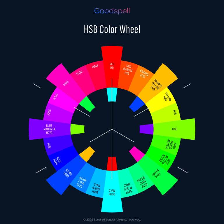
Once you’ve chosen your brand color, the next step is building a palette that makes your UI design sing. A great UI palette includes tints (lighter variations), shades (darker variations), and tinted grays (neutral tones with a brand hint) to ensure flexibility across light and dark modes. In this guide, we’ll create a UI palette based on Hue 216° (a blue-purple from our last post), using HSB (Hue, Saturation, Brightness) for intuition and CIELAB’s L* for scientific precision. We’ll define 10 tints and 10 shades, explore ideal L* ranges for light and dark modes, and explain the purpose of each in UI design. Let’s dive in!
Why Build a Palette?
A single brand color isn’t enough for a polished UI. You need variations to:
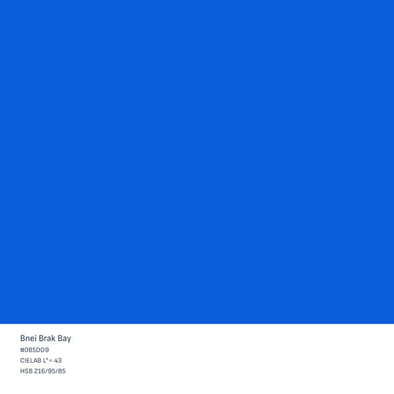
Using Hue 216° (H=216°, S=95%, B=85%, L*≈43), we’ll craft a palette that’s versatile and cohesive for any app or website.
Bnei Brak Bay
#0B5DD9
CIELAB L*= 43
HSB 216/95/85
Vitamin C
#FF9900
CIELAB L*= 72
HSB 36/100/100
Charlie Brown
#955900
CIELAB L*= 43
HSB 36/100/58
Step 1: Understand Tints, Shades, and Tinted Grays
Step 2: Create 10 Tints
Tints are lighter than the base color (L>55), perfect for backgrounds or soft UI elements. We’ll spread them across L=60–95, the most useful range for UI.
How to Make Tints
HSB
CIELAB
10 Tints for Hue 216°
T1
#6D98D9
Secondary button, active state
CIELAB L*= 60
HSB 216/50/85
T2
#729CDB
Highlighted icon, badge
CIELAB L*= 62
HSB 216/48/86
T3
#7AA2DE
Card background (light mode)
CIELAB L*= 65
HSB 216/45/87
T4
#82A8E0
Hover state, subtle accent
CIELAB L*= 68
HSB 216/42/88
T5
#8AAEE5
Sidebar background
CIELAB L*= 70
HSB 216/40/90
T6
#98B9EB
Modal overlay (light)
CIELAB L*= 75
HSB 216/35/92
T7
#A8C5F0
Input field background
CIELAB L*= 80
HSB 216/30/94
T8
#B8D0F5
Disabled button (light mode)
CIELAB L*= 85
HSB 216/25/96
T9
#C8DCFA
Main background (light mode)
CIELAB L*= 90
HSB 216/20/98
T10
#D9E8FF
Near-white background, canvas
CIELAB L*= 95
HSB 216/15/100
Why these? L=60–95 covers light mode needs, from vibrant accents (L=60) to near-white backgrounds (L*=95). Lower S ensures tints aren’t too intense, while H=216° keeps the blue-purple vibe.
Step 3: Create 10 Shades
Shades are darker than the base (L<55), great for text, borders, or dark mode elements. We’ll use L=10–50 for maximum UI utility.
How to Make Shades
10 Shades for Hue 216°
| Tint | HSB (H, S%, B%) | CIELAB L* | Hex Codes | Purpose in UI |
|---|---|---|---|---|
| S1 | 216°, 68%, 75% | 50 | Primary text (light mode) | |
| S2 | 216°, 66%, 70% | 45 | Secondary text, dark button | |
| S3 | 216°, 64%, 65% | 40 | Labels, icons (light mode) | |
| S4 | 216°, 62%, 60% | 35 | Borders, dividers | |
| S5 | 216°, 60%, 50% | 30 | Disabled text, shadows | |
| S6 | 216°, 58%, 45% | 25 | Background (dark mode) | |
| S7 | 216°, 56%, 40% | 22 | Card background (dark mode) | |
| S8 | 216°, 55%, 35% | 18 | Deep accents, icons (dark) | |
| S9 | 216°, 70%, 25% | 15 | Modal overlay (dark mode) | |
| S10 | 216°, 70%, 20% | 10 | Near-black background |
Why these? L=10–50 spans text (L=30–50) to dark mode backgrounds (L*=10–25). Keeping S moderate ensures shades feel branded without being too muted.
Step 4: Add Tinted Grays
Tinted grays are near-neutral but carry a faint Hue 216° hint, replacing pure grays for a cohesive look.
How to Make Tinted Grays
HSB
CIELAB
Example Tinted Grays
Step 5: Ideal L* Ranges for Light and Dark Modes
Step 6: Test Accessibility
Use L* for WCAG compliance (4.5:1 for text):
Tools: WebAIM Contrast Checker, Stark (Figma).
Step 7: Apply and Refine
Mock up your palette in Figma:
Best Practices
Tools
Conclusion
With Hue 216°, we’ve built a UI palette that’s vibrant, accessible, and versatile. Our 10 tints (L=60–95) and 10 shades (L=10–50) cover everything from light mode backgrounds to dark mode text, while tinted grays add cohesion. Try this palette in your next project, or swap Hue 216° for your own brand color. What’s your favorite tint or shade? Share below!