A Perceptually Informed Approach to Color in UI Design Systems

This document outlines a perceptually informed approach to color in user interface UI design systems, integrating theory, tools, and guidelines from the provided sources. This approach emphasizes grounding color choices in the science of human visual perception and leveraging objective measures like CIELAB luminance (L) values* to create more intuitive, accessible, and visually consistent user experiences.

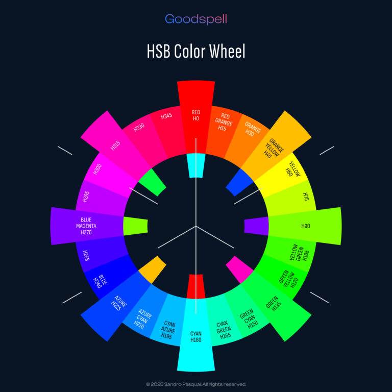
1. The Perceptual Afterimage-Based Color Wheel
This section details the innovative perceptual afterimage-based color wheel developed by Sandro Pasqual. This color wheel departs from traditional and tech-driven models like RGB and CMYK by focusing on human visual perception, specifically the afterimage phenomenon and Ewald Hering’s chromatic opposition theory.
- Perceptual Foundation: The color wheel is rooted in Hering’s theory of opposing color pairs (red-green, blue-yellow, black-white) and the physiological basis of afterimages. Pasqual argues that traditional color wheels, placing complements 180° apart, do not accurately reflect perceived complementary colors. As Pasqual states, “The color wheel I’m presenting here isn’t your typical one. It’s been carefully designed to mirror how humans actually perceive colors, with a special focus on the afterimage phenomenon and subjective experience”.
- Adjusted Complementary Pairs: The wheel modifies the placement of complementary colors based on observed afterimages. For example, the afterimage of red (Hue 0°) is cyan (Hue 170°), not pure green (Hue 120°). Consequently, the wheel pairs Red (Angle 0°, Hue 0°) with Cyan (Angle 180°, Hue 170°). Other adjusted complementary pairs include Orange (Angle 45°, Hue 30°) with Azure (Angle 225°, Hue 210°) and Yellow (Angle 90°, Hue 60°) with Blue (Angle 270°, Hue 240°). The source notes, “Traditional color wheels place complements 180° apart (red opposite green, say), but ours adjusts these positions to match the real complements seen in afterimages”.
- Perceptual Asymmetry and the Green Zone: Humans don’t perceive all colors equally. While green occupies a large portion of the visible spectrum, we distinguish fewer shades of green compared to other colors like yellow or cyan. The proposed wheel reflects this by significantly shrinking the green zone (Angle 125°–145°, centered on Angle 135° (Hue 120°)). Transitions like Green-Yellow (Angle 120°, Hue 105°) and Green-Cyan (Angle 150°, Hue 145°) take up more space, highlighting the sharper distinctions we notice there. The source explains, “To reflect this, the green zone in our wheel is slimmed down to a smaller slice (Angle 125°–145°)…”. Science backs this up as studies in visual physiology show our ability to differentiate green shades drops off compared to other colors.
- Strategic Positioning of Core Colors: The wheel starts with eight core colors, strategically placed based on perceptual relationships and afterimage complements. The addition of Orange (Angle 45°, Hue 30°) is highlighted as a key element bridging red and yellow. Its afterimage, azure (Hue 210°), confirms the blue-cyan complement.
- Interpolation and Munsell Influence: The wheel is further developed by interpolating colors in 15° segments, resulting in 24 hues. This method borrows from the Munsell color system, which arranges hues for perceptually even steps.
- Distinction from Tech-Based Models: Unlike RGB and CMYK, which are optimized for light and pigment mixing, this wheel is designed to reflect human color perception. For instance, RGB places red opposite green, which doesn’t align with the cyan afterimage of red.
2. Dynamic Color Palette Generator
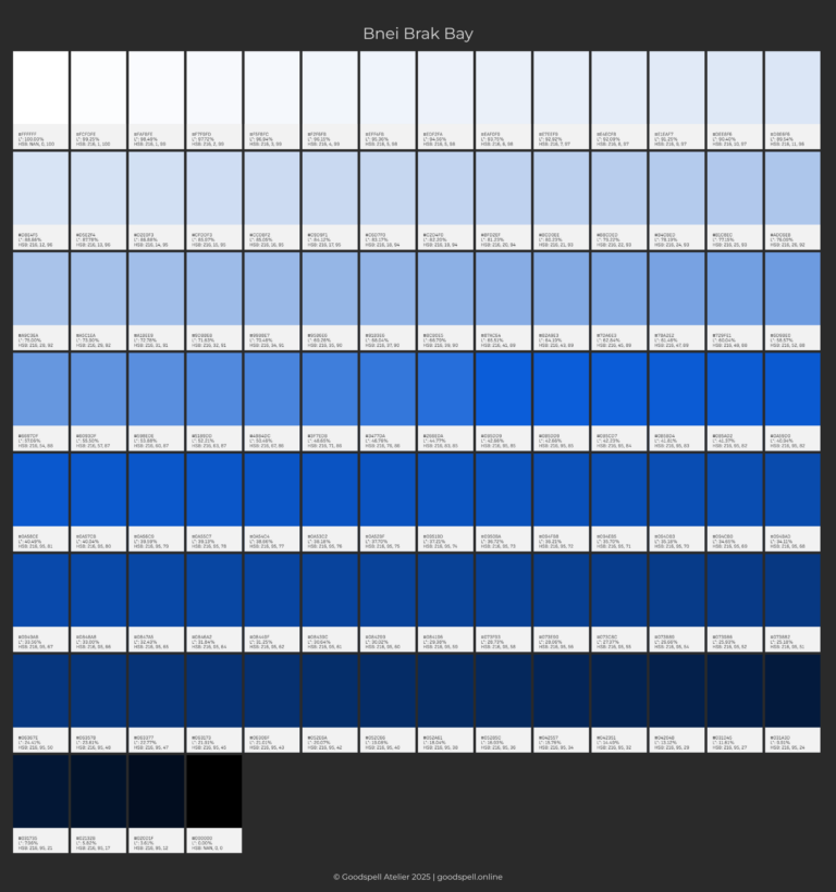
This source describes a tool for creating color palettes based on a user-selected base hue and the generation of tints and shades, incorporating the CIELAB luminance (L) value* for UI design considerations.
- Three-Step Palette Generation: The tool simplifies palette creation into choosing a base hue, tuning tints and shades, and fine-tuning for UI design.
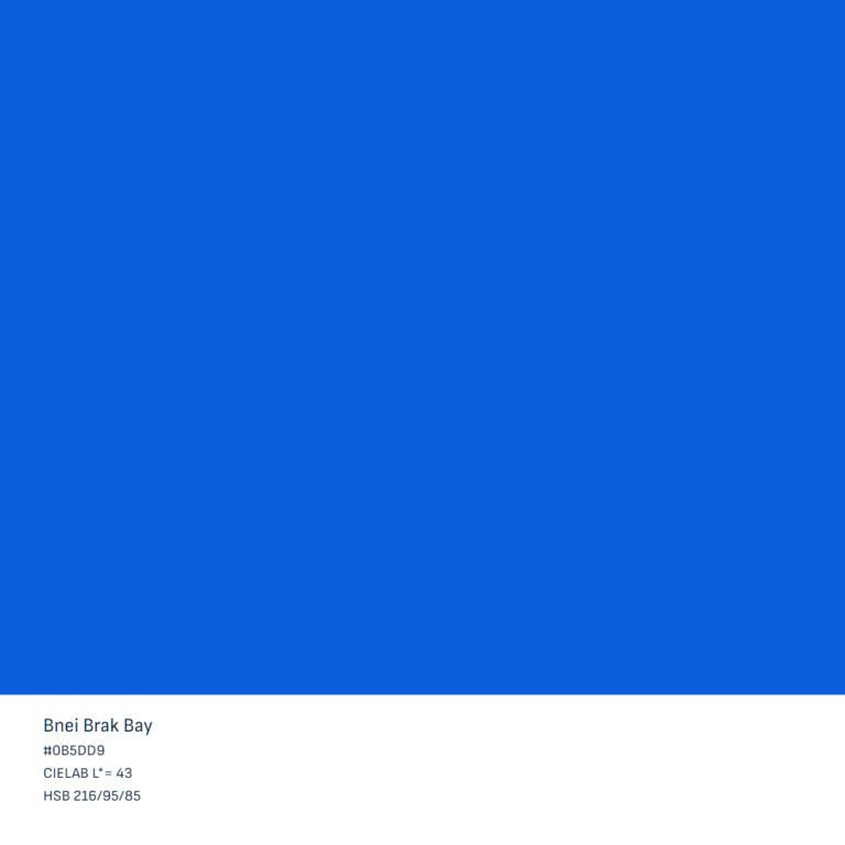
- Hue Picker: Users select a base hue in 10-degree increments at full saturation and brightness.
- Automatic Tint and Shade Generation: The tool generates 50 tints (adding white) and 50 shades (adding black) from the base hue.
- CIELAB Luminance (L) Value:* Each generated swatch displays its L value*, representing perceived lightness. This is crucial for accessible monochrome palettes.
- UI Design Filtering: Users can filter the palette based on minimum and maximum L values*, providing guidance for background (light: L 95–100, dark: L 0–5**), text (light: L 0–10, dark: L 90–100**), and buttons (light: L 30–50, dark: L 60–80**).
- Export Options: Palettes can be exported in various formats (e.g., Figma, Photoshop, JSON, CSS, Text, PNG).
3. UI Design System: Light & Dark Theme Guidelines
This source provides guidelines for designing user interfaces with both light and dark themes, focusing on accessibility and consistency, utilizing the CIELAB luminance (L) value* extensively.
- Luminance-Based Color Definitions: Color specifications for backgrounds, text, interactive elements, icons, and feedback states are primarily defined by their L values*, ensuring consistent perceived lightness and contrast, adhering to WCAG 2.1 contrast guidelines.
- Background Layers: Specific L ranges* are provided for primary (light: L 95–100, dark: L 0–5), secondary (light: L* 90–95, dark: L* 5–10), and surface backgrounds (light: L* 80–90, dark: L* 10–20)** in both themes to establish visual hierarchy. Elevated surfaces also have L* recommendations, often with subtle shadows (light: L* 90, dark: L* 15–20).
- Text and Content Accessibility: Primary text (light: L 0–10, dark: L 90–100), secondary text (light: L* 10–20, dark: L* 80–90), interactive text (light: L* 30–40 hover L* 50, dark: L* 60–70 hover L* 50), and disabled text (light: L* 40–60, dark: L* 40–60)** have defined L* values for readability.
- Interactive Elements: Primary buttons (light: normal L 30–50, hover L +10, active L* -10; dark: normal L* 60–80, hover L* -10, active L* +10)** and secondary buttons (light: normal L 80–90, hover L 70–80; dark: normal L* 20–30, hover L* 30–40)** have L* specifications for different states. Inputs also have background and text L* value guidelines (light: background L* 90–95, text L* 0–10; dark: background L* 10–20, text L* 90–100).
- Icons and Navigation: Active icons (light: L 0–10, dark: L 90–100)** and inactive icons (light: L 40–60, dark: L 40–60), as well as navigation bar styling (light: background L 95–100, icons/text L 0–10; dark: background L* 0–5, icons/text L* 90–100), are defined by L* values.
- Feedback and State Elements: Error alerts (light: background L 30–40, text L 100; dark: background L* 60–70, text L* 0), success/confirmation messages (light: background L* 40–50, text L* 100; dark: background L* 70–80, text L* 0), and loading indicators (light: accent color L* 50; dark: light accent color L* 75)** utilize L* values.
- Depth and Shadows: Shadows for elevated elements have L 80–90* in light themes and L 10–20* in dark themes. Modals and tooltips also have background and shadow L* specifications (light: background L* 95, shadow L* 80; dark: background L* 5, shadow L* 20).
- Data Visualization: Saturated colors (L 40–70)* are suggested for charts in light themes, and lighter colors (L 60–90)* for dark themes. Tooltips in charts also have L* guidelines (light: background L* 100, text L* 0; dark: background L* 0, text L* 100).
4. Connections and Implications
These three elements are interconnected. The perceptual color wheel offers a theoretical foundation based on human vision, informing base hue selection in the dynamic color palette generator for perceptually relevant palettes. The dynamic color palette generator provides a practical tool using L values* to implement color choices in a UI design system, supporting accessibility and consistency. The UI design system leverages perceived lightness (L)* for consistent and accessible interfaces across themes. This represents a holistic approach.
5. Conclusion
Integrating perceptual color theory with objective luminance metrics offers a powerful framework for enhanced UI design. By prioritizing human perception and utilizing L* values, designers can create more intuitive, harmonious, accessible, and visually consistent digital interfaces.