The world of color can feel vast and complex. But tools like the HSB color model (Hue, Saturation, Brightness) simplify it for artists, designers, and developers. HSB makes color intuitive and accessible.
What You’ll Discover in This Post
Here’s what we’ll explore:
What is HSB? A clear definition of the HSB model.
Why HSB Stands Out: How it compares to RGB and CMYK, and why artists prefer its simplicity.
Our Perceptual Afterimage-Based Color Wheel: Inspired by Sandro Pasqual’s work at Goodspell, we’ll show how we used HSB to:
Balance complementary colors.
Map Angle (A) to Hue (H).
Align with historical systems like the Munsell color wheel.
Shorthand Notation: A quick guide to naming intermediate colors.
New Tools: Exciting resources to help you create afterimage-based color palettes.
What is the HSB Color Model?
HSB stands for Hue, Saturation, Brightness, a color model that represents colors in a way that aligns with how humans perceive them:
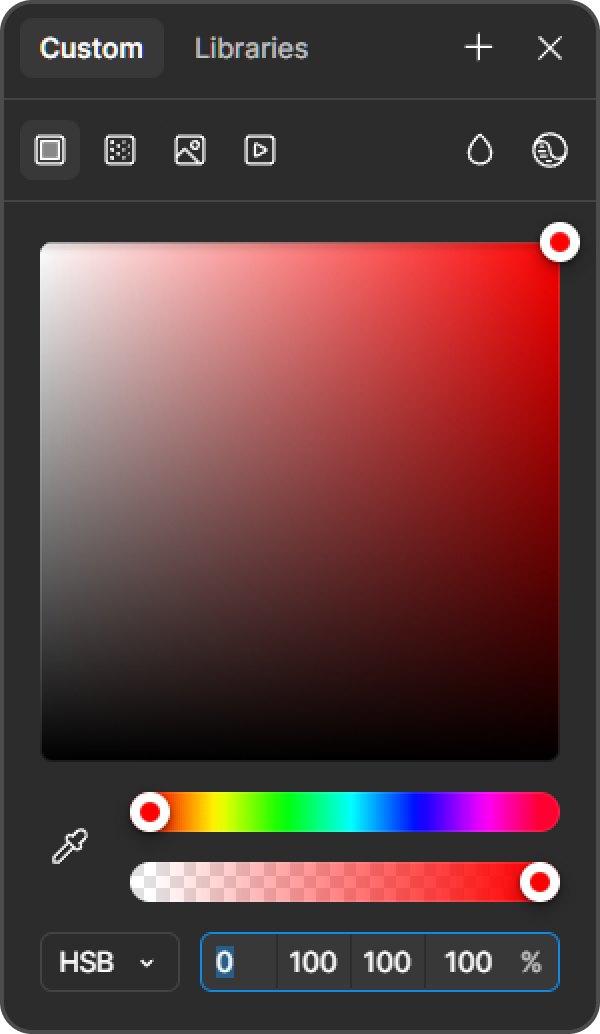
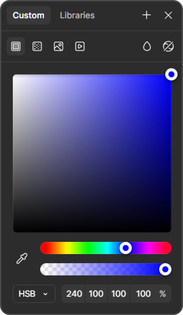
Hue (H): The type of color (e.g., red, blue, yellow), measured in degrees from 0° to 360° on a color wheel. For example, 0° is red, 120° is green, and 240° is blue.
Saturation (S): The intensity or purity of the color, from 0% (gray) to 100% (fully vivid).
Brightness (B): The lightness of the color, from 0% (black) to 100% (full brightness).
HSB has distinct advantages over other color models like RGB (Red, Green, Blue) or CMYK (Cyan, Magenta, Yellow, Key/Black):
Intuitive for Humans: HSB mirrors how we think about color. We describe a color as “a bright, vivid blue” (high brightness, high saturation, blue hue), not as a mix of red, green, and blue values (RGB). RGB is great for screens but feels technical—e.g., RGB(0, 128, 255) doesn’t immediately tell you it’s a vibrant blue.
Easier Adjustments: Want a lighter blue? In HSB, you increase Brightness. Want it less intense? Decrease Saturation. In RGB, you’d need to adjust all three values (R, G, B) simultaneously, which is less intuitive.
Artist-Friendly: Unlike CMYK, which is tailored for print and subtractive color mixing, HSB works additively and is device-independent, making it ideal for digital art and design tools like Photoshop, Figma, or Procreate.
Perceptual Uniformity: HSB aligns with human perception better than RGB. A change in Hue feels like a natural shift around the color wheel, while changes in RGB values can produce unexpected results.
Why Artists Prefer HSB
Artists gravitate toward HSB because it matches their creative process:
Natural Workflow: Artists think in terms of “shade,” “tone,” and “intensity.” HSB’s Brightness and Saturation let them adjust these directly without worrying about mixing ratios (as in RGB) or print limitations (as in CMYK).
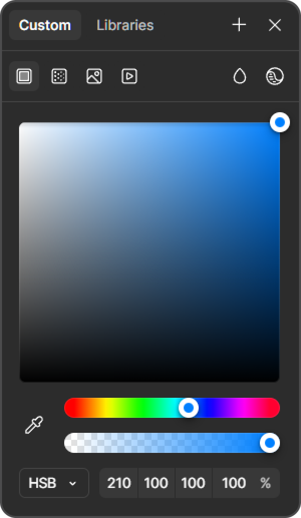
Color Wheel Navigation: HSB’s Hue component maps directly to a color wheel, making it easy to find complementary, analogous, or triadic colors. For example, in our project, we chose Hue 216°, which sits between Azure (H210) and Blue (H240), and its complementary afterimage (around H36, Orange-Yellow) was easy to calculate.
Experimentation: Artists can tweak one parameter at a time—e.g., keeping Hue fixed at 216° while adjusting Saturation and Brightness to create tints (like T1: HSB 216/90/88) and shades (like S1: HSB 216/95/80)—without affecting the others.
Why HSB is Easier to Perceive and Apply
HSB is more intuitive because it separates what a color is (Hue) from how it looks (Saturation and Brightness):
Perceptual Clarity: Hue defines the color family, which is the first thing we notice (e.g., “this is blue”). Saturation and Brightness then refine the feeling—vibrant or muted, light or dark. This matches how our brains process color, unlike RGB’s additive mixing, which feels like a math problem.
Practical Application: In tools like Figma or Photoshop, HSB sliders let you adjust colors visually. For our Hue 216°, we started with HSB 216/95/85 and easily created tints by lowering Saturation and raising Brightness (e.g., T10: HSB 216/20/100), and shades by lowering Brightness (e.g., S10: HSB 216/50/20).
Universal Understanding: Non-technical users grasp HSB quickly. Saying “make it a brighter, less saturated blue” translates directly to HSB adjustments, while RGB or CMYK requires more expertise.
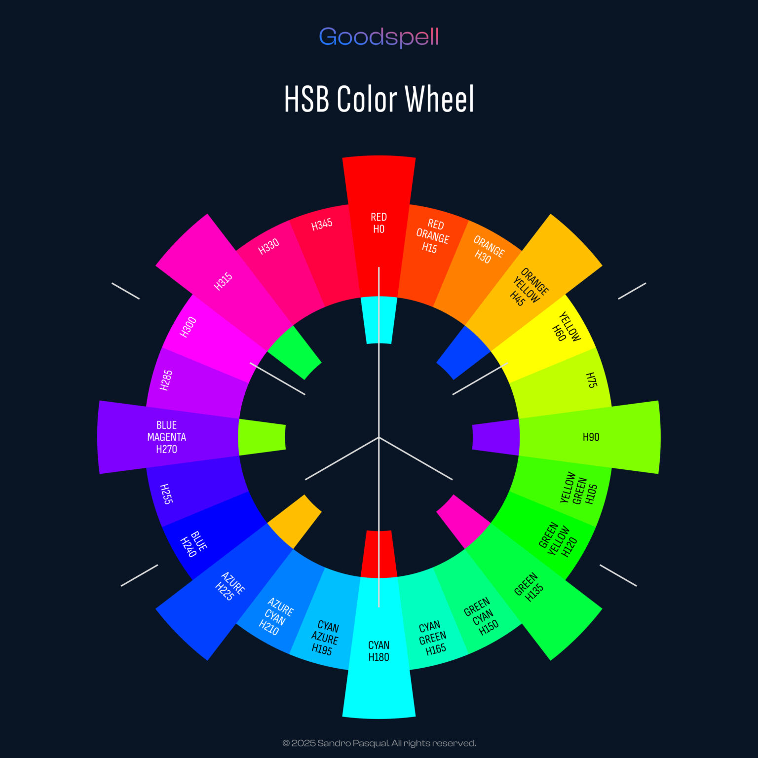
Our Perceptual Afterimage-Based Color Wheel: Uniform Hue Distribution and Complementary Balance
Inspired by Sandro Pasqual’s Perceptual Afterimage-Based Color Wheel, we’ve built a system that leverages HSB’s strengths while introducing perceptual balance:
Uniform Hue Distribution
Traditional color wheels often space hues unevenly, but we redistributed them uniformly around the 360° circle to align with human perception. For example:
Red: Angle 0°, H0.
Yellow: Angle 90°, H60.
Cyan: Angle 180°, H170.
Blue: Angle 270°, H240.
Magenta: Angle 315°, H300.
This ensures each hue is perceptually equidistant, making transitions smoother and more predictable.
Complementary Opposition
We balanced the wheel by placing complementary colors 180° apart, using the afterimage effect (staring at a color makes you see its opposite). For instance:
Blue (Angle 270°, H240) is opposite Yellow (Angle 90°, H60).
Red (Angle 0°, H0) is opposite Cyan (Angle 180°, H170).
In our project, Hue 216° (between Azure at H210 and Azure-Blue at H225) has an afterimage around H36 (Orange-Yellow), which is roughly 180° apart (216 + 180 = 396, adjusted to 396 – 360 = 36), confirming the balance.
Equivalence Between Angle (A) and Hue (H)
In our wheel, the Angle (A) and Hue (H) are not identical but follow a specific mapping to align with perception:
Angle 0° = H0 (Red).
Angle 90° = H60 (Yellow).
Angle 180° = H170 (Cyan).
Angle 270° = H240 (Blue).
Angle 315° = H300 (Magenta).
The relationship isn’t linear due to perceptual adjustments, but for practical purposes, we treat them as roughly equivalent when selecting hues. For example, Azure at Angle 225° corresponds to H210, and Blue at Angle 270° corresponds to H240, a 45° angle difference equating to a 30° hue difference.
Color Distribution and Notation in the Munsell Color Wheel
The Munsell color system, developed by Albert H. Munsell in the early 20th century, is a historical precursor to our approach. It organizes colors in a 3D space using Hue, Value (lightness), and Chroma (saturation), similar to HSB’s structure:
Hue Distribution: Munsell’s wheel divides hues into 10 main sections (e.g., R, YR, Y, GY, G, BG, B, PB, P, RP), with 5 principal hues (R, Y, G, B, P) and 5 intermediates (YR, GY, BG, PB, RP). Each section is further subdivided, creating 40 hues total (0 to 100 on the Munsell scale, where 0/100 is Red, 25 is Yellow, 50 is Green, etc.).
Notation: Colors are notated as Hue Value/Chroma (e.g., 5B 5/10 means a Blue hue, Value 5, Chroma 10). In HSB terms, this might translate to a Hue around 240°, with Value mapping to Brightness and Chroma to Saturation.
Comparison to Our Wheel: Our Perceptual Afterimage-Based Color Wheel simplifies this by focusing on HSB and afterimages. We use a 360° circle with uniform hue steps (e.g., 45° between Azure at H210 and Blue at H240) and note colors directly in HSB (e.g., Hue 216°). Munsell’s system is more granular for physical pigments, but our digital approach prioritizes perceptual balance and ease of use.
Shorthand Notation for Intermediate Colors
In our color wheel, we use shorthand notations for intermediate colors to describe hues between primary and secondary colors, similar to Munsell’s naming but adapted for our system:
Primary and Secondary Colors:
Orange (O): Angle 45°, H30.
Yellow (Y): Angle 90°, H60.
Intermediates:
Between Orange (O) and Yellow (Y), we have:
OY (Orange-Yellow): Angle 60°, H45. This leans more toward Orange but has a Yellow influence.
YO (Yellow-Orange): Angle 75°, H52.5. This leans more toward Yellow but retains some Orange warmth.
Application in Our Project: When selecting Hue 216°, we worked between Azure (Angle 225°, H210) and Blue (Angle 270°, H240). The intermediates were:
Azure-Blue (Angle 240°, H225): Leaning more toward Blue but with Azure’s freshness.
Blue-Azure (Angle 255°, H232.5): Closer to Blue but with a hint of Azure’s coolness. This shorthand (e.g., Azure-Blue, Blue-Azure) helps us communicate the color’s position on the wheel clearly and aligns with traditional systems like Munsell’s naming conventions.
Tying It Back to Our Project
In our previous posts, we used HSB to select Hue 216°, a blue with a subtle purple undertone, by evaluating the intermediates between Azure (H210) and Blue (H240). HSB’s intuitive nature allowed us to:
Easily navigate the color wheel to find Hue 216°, knowing its complementary afterimage (H36) would evoke a warm, energetic contrast.
Adjust Saturation and Brightness to create a versatile palette (e.g., tints like T1: HSB 216/90/88, shades like S1: HSB 216/95/80).
Visualize the color’s role in our UI mockup, where tints and shades layered beautifully to create depth and harmony.
Tools for Developing Afterimage-Based Color Palettes
To further support designers in creating color palettes based on afterimage effects and human perception, we’ve developed two powerful tools:
Perceptual Afterimage Color Calculator: Available at https://goodspell.online/perceptual-afterimage-color-calculator/, this application converts colors from the HSB system to the Goodspell/Sandro Pasqual system. It provides a system of equivalents, allowing you to map HSB hues to our Perceptual Afterimage-Based Color Wheel and identify their complementary afterimages effortlessly. For example, entering Hue 216° in the calculator reveals its afterimage at H36 (Orange-Yellow), streamlining the process of balancing colors for your palette.
Graphical Representation of HSB and Goodspell/Sandro Pasqual Color Wheels: We’ve also created a visual comparison of the HSB color wheel and the Goodspell/Sandro Pasqual color wheel, highlighting their differences and equivalencies. This graphical tool helps you understand how hues are distributed in both systems and how the Goodspell system adjusts for perceptual uniformity and afterimage effects. It’s an invaluable resource for visualizing complementary colors and planning your palette.
These tools complement traditional design software like Figma or Photoshop, making it easier to build palettes that leverage the afterimage effect for maximum visual impact.
Conclusion: Why HSB and Our Tools Shine
The HSB color model is a powerful tool for artists and designers. It offers an intuitive, human-centric way to work with color.
Why HSB Excels
HSB has clear advantages over RGB and CMYK:
Ease of Use: Simple adjustments for creative control.
Perceptual Clarity: Mirrors how we see and think about color.
Creative Workflow: Aligns with artists’ natural processes, making it a favorite in the art world.
Our Perceptual Afterimage-Based Color Wheel
We’ve harnessed HSB to build a balanced system:
Hues are evenly distributed for perceptual harmony.
Complementary colors are perfectly opposed, using afterimage effects.
Intermediates are clearly notated with shorthand names.
New Tools for Color Design
Our latest tools make designing palettes effortless:
Perceptual Afterimage Color Calculator: Find complementary afterimages with ease.
Graphical Representation: Compare HSB and Goodspell/Sandro Pasqual color wheels to visualize hue relationships.
These tools simplify creating palettes based on afterimage effects and human perception.
Your Turn to Create
Whether you’re an artist or designer, HSB and our color wheel can help you find the perfect hue for your next project.
This document outlines a perceptually informed approach to color in user interface UI design systems, integrating theory, tools, and guidelines from the provided sources. This approach emphasizes grounding color choices in the science of human…
The color wheel I’m presenting here isn’t your typical one. It’s been carefully designed to mirror how humans actually perceive colors, with a special focus on the afterimage phenomenon and subjective experience. Unlike tech-driven models…
Once you’ve chosen your brand color, the next step is building a palette that makes your UI design sing. A great UI palette includes tints (lighter variations), shades (darker variations), and tinted grays (neutral tones…
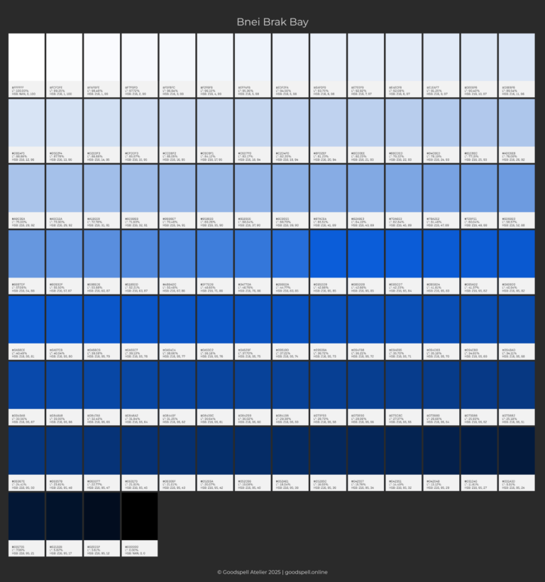
Bnei Brak Bay #0B5DD9 CIELAB L*= 43 HSB 216/95/85 Choosing a brand color is like defining your brand’s personality—it sets the tone, evokes emotions, and makes your design stand out. Whether you’re creating a website,…
Manage Consent
To provide the best experiences, we use technologies like cookies to store and/or access device information. Consenting to these technologies will allow us to process data such as browsing behavior or unique IDs on this site. Not consenting or withdrawing consent, may adversely affect certain features and functions.
Functional
Always active
The technical storage or access is strictly necessary for the legitimate purpose of enabling the use of a specific service explicitly requested by the subscriber or user, or for the sole purpose of carrying out the transmission of a communication over an electronic communications network.
Preferences
The technical storage or access is necessary for the legitimate purpose of storing preferences that are not requested by the subscriber or user.
Statistics
The technical storage or access that is used exclusively for statistical purposes.The technical storage or access that is used exclusively for anonymous statistical purposes. Without a subpoena, voluntary compliance on the part of your Internet Service Provider, or additional records from a third party, information stored or retrieved for this purpose alone cannot usually be used to identify you.
Marketing
The technical storage or access is required to create user profiles to send advertising, or to track the user on a website or across several websites for similar marketing purposes.