How to Choose the Perfect Brand Color
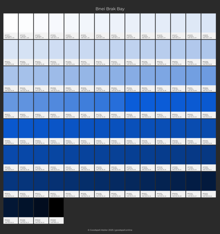
Bnei Brak Bay
#0B5DD9
CIELAB L*= 43
HSB 216/95/85
Choosing a brand color is like defining your brand’s personality—it sets the tone, evokes emotions, and makes your design stand out. Whether you’re creating a website, app, or logo, the right color can increase brand recognition by up to 80% (Reboot, 2020) and shape how people connect with your brand. In this guide, we’ll simplify the process of finding the perfect color with four tools we’ve developed:
- Perceptual Color Wheel: Explore colors as your eyes naturally perceive them, making it easy to select hues that harmonize perfectly.
- Dynamic Color Palette Generator: Create a cohesive set of shades and tints that work seamlessly across your brand and look stunning everywhere.
- Perceptual Afterimage Color Calculator: Discover your opposite color (perceptual afterimage) to create striking contrasts.
- HSB Color Model Guide: Learn the essentials of Hue, Saturation, and Brightness to mix colors like a pro, hassle-free.
We’ll combine the HSB (Hue, Saturation, Brightness) model with the L* from CIELAB to ensure your colors are both beautiful and functional. No design skills required—this is for everyone!
Why Your Brand Color Matters
Your brand color isn’t just a pretty shade—it’s a visual handshake. Studies show that 85% of shoppers say color influences their purchases (Kissmetrics, 2010), and it can shape trust, excitement, or calm. A great brand color should:
- Pop: Be memorable and distinct.
- Work hard: Look good in logos, buttons, or backgrounds.
- Play nice: Meet accessibility standards like WCAG 2.1 for readability.
- Feel like you: Reflect your brand’s vibe, whether it’s bold, friendly, or elegant.
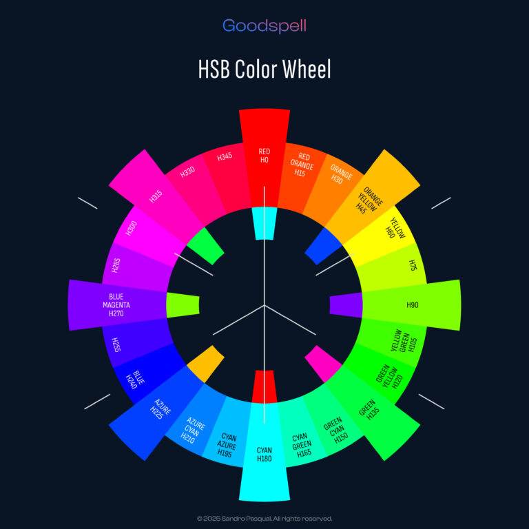
In this tutorial, we’ll use the Perceptual Afterimage-Based Color Wheel (check out the image above!) to find a hue that mixes trust with creativity, guiding us to a color that’s perfect for our brand.

Step 1: Define Your Brand’s Personality
Before diving into colors, ask: What’s my brand about? Colors carry emotional weight, and the Perceptual Afterimage-Based Color Wheel labels them with specific hues and their afterimage opposites, helping us understand their perceptual impact:
Red
Angle 0°
#FF0000
Green
Angle 135°
#01FF01
Blue
Angle 270°
#0101FF
Magenta
Angle 315°
#FF01FF
Consider:
- Brand vibe: Are you playful, serious, or luxurious?
- Audience: Teens, professionals, or global users?
- Usage: Will the color live on screens, print, or packaging?
Our Brand Scenario
We’re designing for a startup that wants to feel innovative yet trustworthy, with a modern, approachable edge. We need a color that blends the trust of blue with the creativity often associated with hues near blue, making it ideal for apps, websites, or logos without feeling too corporate or too whimsical. Our audience is professionals who value reliability but appreciate a creative spark.
Step 2: Explore the Perceptual Afterimage-Based Color Wheel
The Perceptual Afterimage-Based Color Wheel is unique—it’s built on the concept of afterimages, where staring at a color for a while makes you see its opposite when you look away. This helps us understand how colors interact perceptually and emotionally.
The wheel labels hues with their angles (e.g., Blue at Angle 270°; Azure at Angle 225°) and their opposites (e.g., Blue’s opposite is Yellow at Angle 90°).
Aligning with Brand Personality
Since we want trust (blue) and a touch of creativity (often found in hues near blue, like blue-purples), we’ll focus on the intermediate range between Azure (Angle 225°) and Blue (Angle 270°). This segment includes only two intermediate hues on our color wheel, positioned with easily noticeable differences in their shades:
Azure
Angle 225°
Azure-Blue
Angle 240°
Blue-Azure
Angle 255°
Blue
Angle 270°
Considering Personal Preferences
We’re looking for a color that feels modern and approachable, not too stark or overly bold. The hues between Azure (Angle 225°) and Blue (Angle 270°) are ideal—trustworthy without being too cold, creative without being eccentric. We want a hue with a subtle purple undertone to evoke creativity while maintaining a professional tone, fitting our startup’s innovative yet reliable vibe.
Afterimage Insight
The afterimage of a hue can influence how it’s perceived in context. Let’s examine the afterimages for our range:
Azure-Blue (Angle 240°) has an afterimage of Orange-Yellow (Angle 60°), which feels warm and energetic.
Azure-Blue
Angle 240°
Orange – Yellow
Angle 60°
Blue-Azure (Angle 255°) has an afterimage of Yellow-Orange (Angle 75°), which is also warm but slightly brighter.
Blue -Azure
Angle 255°
Yellow – Orange
Angle 75°
A hue around Azure (Angle 225°) and Azure-Blue (Angle 240°) would have an afterimage between Angle 45° and Angle 60° (Orange to Yellow), which feels warm and energetic—perfect for balancing our startup’s reliable yet innovative personality.
Narrowing Down
We evaluate the two intermediate hues in this range:
Azure-Blue (Angle 240°) feels close to what we want—it has the trust of blue with a modern, creative undertone, but it’s slightly too blue, leaning a bit more corporate than we’d like.
Azure-Blue
Angle 240°
Blue-Azure (Angle 255°) feels too cool and professional, lacking the creative spark we’re after.
Blue-Azure
Angle 255°
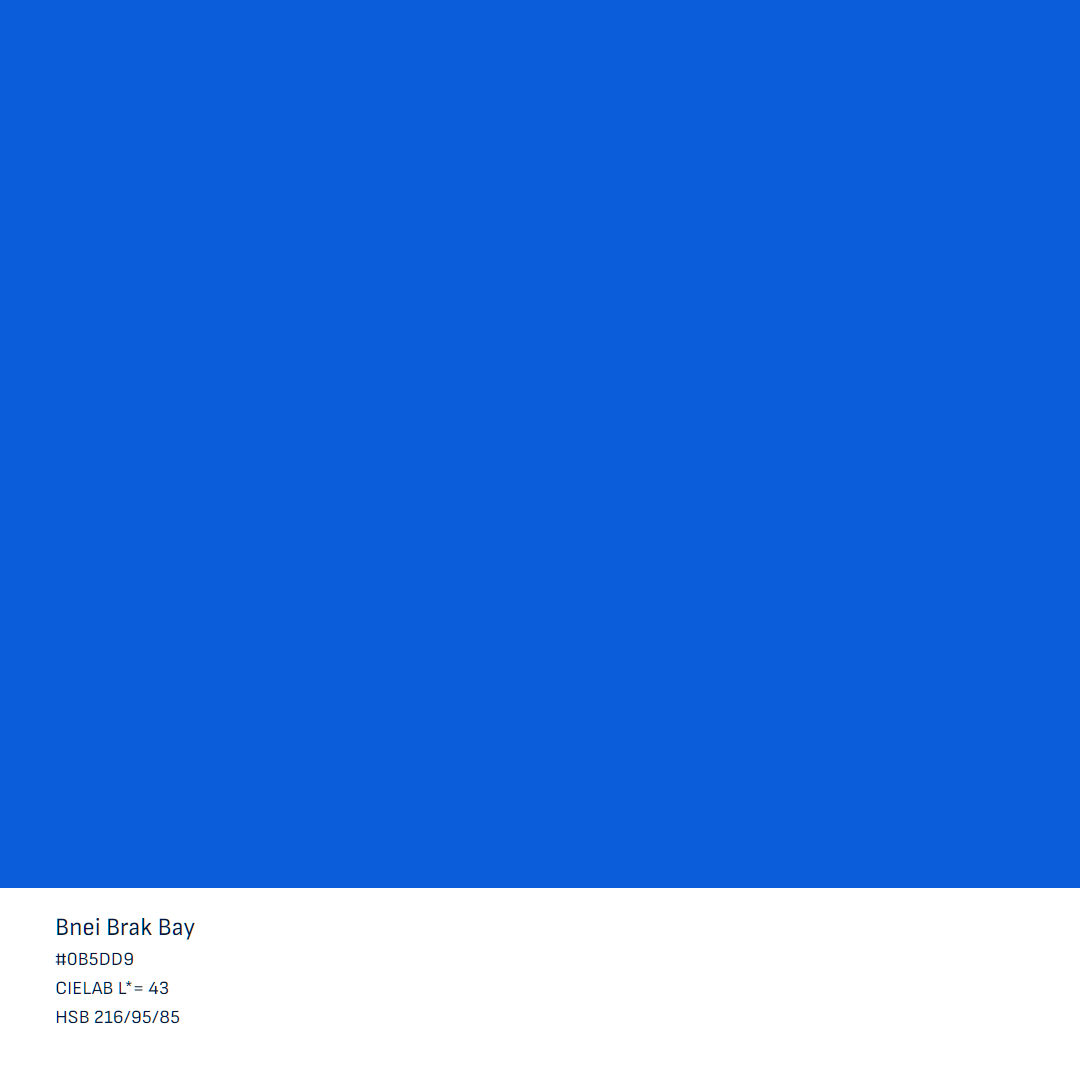
Since we’re aiming for a hue closer to Azure to retain that creative flair, we used the Perceptual Afterimage Color Calculator to search degree by degree and check the afterimage color. After careful exploration, we settled on Angle 231°, which sits just beyond Azure (Angle 225°) and before Azure-Blue (Angle 240°). This hue blends a vibrant blue with a subtle purple undertone, striking the perfect balance of modern creativity and trustworthy professionalism for our brand.
Evaluating the Opposing Hue
It’s always wise to identify the perceptually opposite hue to ensure it aligns with our brand’s goals and avoids potential conflicts. Using the Perceptual Afterimage Color Calculator, we determined that the exact opposite of our chosen hue at Angle 231° is Angle 51°. This hue falls in the orange-red range, conveying warmth, energy, and enthusiasm. For our startup, which aims to be innovative yet trustworthy, this opposing hue can complement our primary color by adding vibrant, energetic contrast when needed—such as in call-to-action buttons or highlights. However, its bold and intense tone might feel too overpowering for broader use in our brand’s primary palette, as it could overshadow the calm, reliable vibe we’re aiming for.
Knowing this, we can strategically use shades or tints of this color sparingly for accents, ensuring our core design remains aligned with our goal of balancing creativity and professionalism.
Step 3: Select Your Base Color
Starting Saturated Hue
Angle 231°
A brand color should be vibrant but versatile. In HSB:
- Saturation: 50–95% for punch without being neon.
- Brightness: 70–90% to avoid being too dark or faded.
In CIELAB:
- L: 40–70 for flexibility (L=50–60 is the sweet spot).
Our Choice
We’ve selected a hue at Angle 231° with a saturation of 95% and brightness of 85%. This creates a rich blue with a subtle purple undertone that’s bold yet approachable. In CIELAB, its L value is slightly darker than the typical sweet spot but still versatile—bright enough for buttons, dark enough for contrast.
Why It’s Great
Our chosen hue feels creative and modern, aligning with our startup’s innovative yet trustworthy vibe. The slightly darker tone makes it adaptable for logos, icons, or UI accents, fitting our preference for a deeper, more grounded feel compared to lighter hues like Azure. The afterimage (around H36, Orange-Yellow) adds a warm, energetic contrast that complements our brand’s approachable edge.
Step 4: Test for Usability
Your color must perform well in real-world scenarios:
- Contrast: Test if it works on common backgrounds like white (L=100) or black (L=0). Use a contrast checker like WebAIM to aim for a 4.5:1 ratio for text readability.
- Context: Mock it up in tools like Figma or Canva to see if it stands out on buttons or feels right in a logo.
- Color Blindness: Use tools like Stark to ensure it’s distinguishable—blue hues like H216 are generally safe, as they’re less affected by common types of color blindness.
Example Check
Our hue at H216 with a saturation of 95% and brightness of 85% on a white background yields a contrast ratio of approximately 2.1—too low for small text but acceptable for accents or larger text at a 3:1 ratio. To meet WCAG 2.1 standards for text, we’ll create darker shades in the next post.
Step 5: Refine and Document
Tweak the hue if necessary:
- Too bright? Lower the brightness to 80%.
- Too dull? Adjust the saturation to 90%.
Document your choice—our hue at H216, with a saturation of 95% and brightness of 85%—in your team’s style guide to ensure consistency across all brand materials.
Conclusion
Selecting a brand color is a journey of balancing emotion, perception, and functionality. The Perceptual Afterimage-Based Color Wheel guided us to explore hues and their opposites, leading us to a blue at H216 with a subtle purple undertone that perfectly blends trust and creativity for our innovative, approachable startup. With the Perceptual Afterimage Color Calculator, we confirmed its exact opposite, H36, ensuring no future surprises with clashing tones. The HSB model helped us fine-tune the vibe, while CIELAB ensured precision with a slightly darker, versatile tone. In our next post, we’ll craft a full palette with complementary tints, shades, and tinted grays to bring this color to life across all your brand’s touchpoints. Now it’s your turn to explore—visit the Perceptual Afterimage-Based Color Wheel and discover a hue that captures your brand’s essence!